KAMA UI Facelift
Company: PUIG
Brand: L’Artisan Parfumeur, Penhaligon’s, KAMA Ayurveda, LOTOS
Role: Product Design, UI Design Lead
Background
The brand required a UI facelift for the current website. After conducting an in depth analysis and reviewing visual references, we identified that many of the issues stemmed from underdeveloped brand assets rather than structural UX problems. Given the limited project budget, our strategy focused on refining existing visual assets and introducing subtle but impactful design enhancements to elevate the overall experience and create a more premium feel.
As part of the white label ecosystem, Kama was the first brand to go live. Since its initial launch, several new features have been developed across the platform. We took this opportunity to incorporate those newly built features into the facelift, ensuring the refreshed experience not only looked more refined but also aligned with the latest product capabilities.
Homepage
Product Detail Page
Sitewide UI issues
Introduction
Which Pages involved?
Project Background


Homepage Improvement
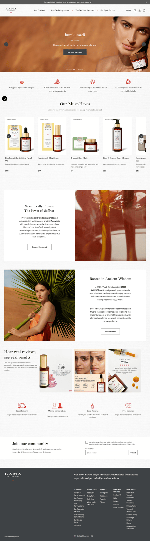
Before
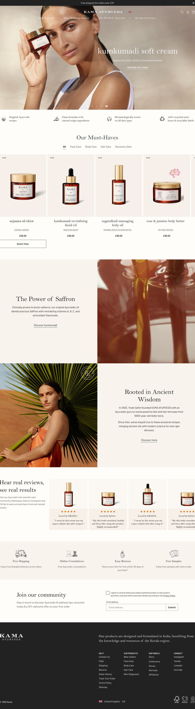
After
Before & After


Analysis Old UI
Visually Unbalanced Banner
_______________________________
Distracted colour elements
__________________________
Colourful product boxes
____________________
Unnecessary gaps and margins
__________________
Miss aligned product information
_________________________
Overload of contents
______________________________
Messy visual elements
___________________________________________
Styling issues
______________________
_______________________________
Uncertain grey colour
____________________________
Considering use transparent Header
___________________
Unecessary gaps and margin
The breadcrumb occupies nearly one-fifth of the first screen, and the textured background visually creates excessive spacing.
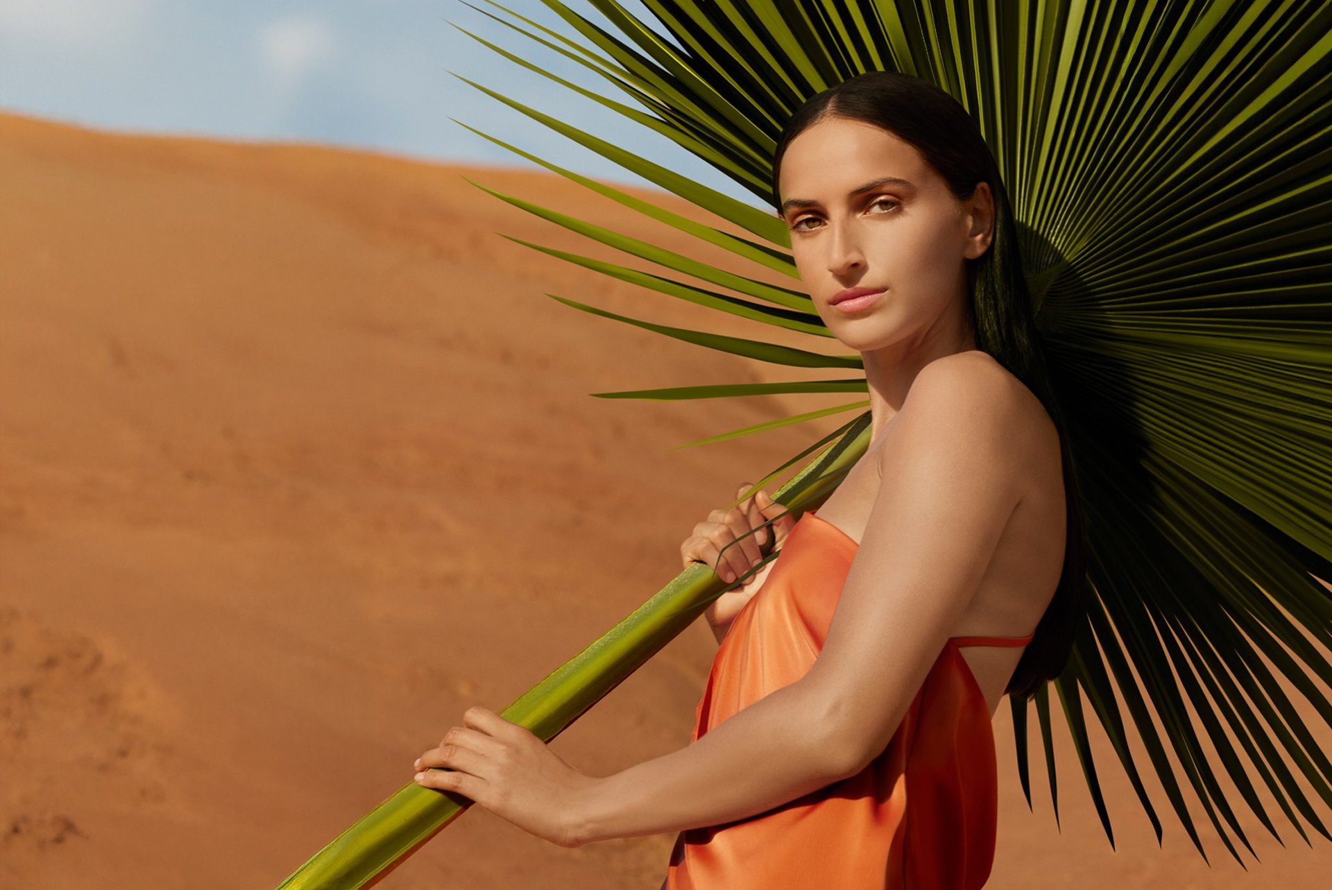
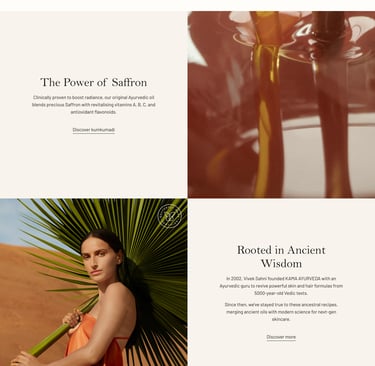
Old Homepage
Homepage banner:
Apply a darker colour to the promo bar and footer to enhance clarity and contrast on the page
Use a transparent header. → Reduces visual clutter, creates a clean, modern immersive look.
Increase banner height. → Gives the content more breathing space and creates a stronger first impression.
Replace button with a text link. → Keeps the design light and minimal, avoids distraction from the main message.
Increase headline font size. → Creates a clear visual hierarchy between the headline and body copy.
Limit banner text to a maximum of two font sizes.
Layout: Position text and visuals to maintain balance.
Overall:
Remove the texture background and use a pure white colour instead.
Remove unnecessary paddings and margins
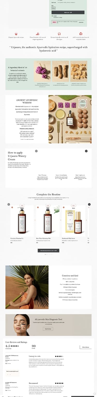
Improvement points-What have been done
Product shots
Apply a neutral light grey background colour to the product shots.
Remove any colourful boxes from the background.
Center the product bottle in the image.
Center-align the product information.
Use lowercase for the product name.
Change the description font style and keep it to a single line as it's a more slim style.
Content blocks
Remove the left and right margin for content blocks
Remove the gap between two content blocks
Change box button to text link and apply the hover animation for the text link
Reduce the content character count
Image assets
Keep image assets clean: minimal text, neutral background colours.
NEW Homepage
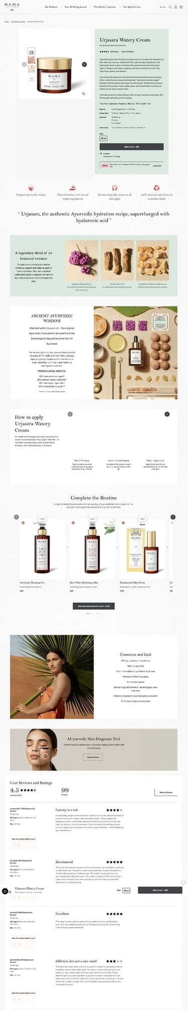
Analysis 'Current PDP Page'
Unecessary gaps and margin
The breadcrumb occupies nearly one-fifth of the first screen, and the textured background visually creates excessive spacing.

Product image
The product feels off-center in the image, with the thumbnail taking up a disproportionately large area.
Character counts
Overload of character counts in Product cluster, content blocks area
Background texture
Textured background visually creates excessive spacing.
Distracted colour elements

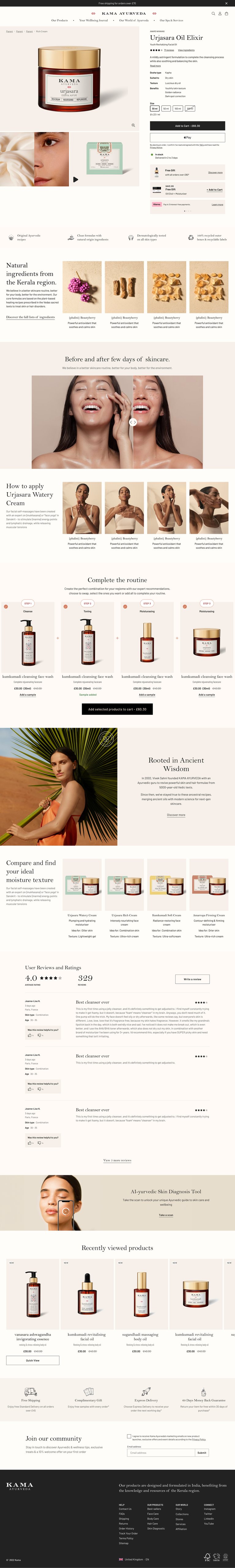

Product Detail Page Improvement
Before
After
Before & After
Product Cluster
- Position the breadcrumb over the product image, minimize spacing, and ensure the first screen displays product information
- Replace the slideshow with a grid view showing all images.
- Remove any text or extra elements from the product shots.
- Remove paddings/margins to enlarge the product images as much as possible.
Product Carousel
- Reduce the size of the product thumbnails.
- Adjust image scaling behavior and remove the carousel when there are fewer than five products.
Ingredient block
- Remove margin
- Remove colour background
Content Blocks
- Reduce the content length and character counts
- Added more relevant content compent based on product type
Mobile Before & After


Homepage Before & After
PDP Before & After