White Label Design System
Upgraded the entire website and developed a comprehensive design system for in-house brands, including L’Artisan Parfumeur, Penhaligon’s, KAMA Ayurveda, LOTOS, and Dr. Barbara Sturm. Collaborated closely with development, brand, and e-commerce teams while presenting innovative ideas across multiple strategic directions.
Company: PUIG
Brand: L’Artisan Parfumeur, Penhaligon’s, KAMA Ayurveda, LOTOS,
Role: Product Design
Collections
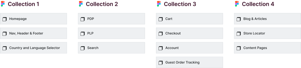
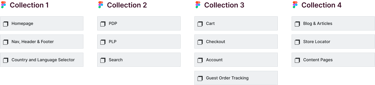
We structured the entire site in Figma into four collections, each containing related pages and features. This approach allowed us to maintain a clear hierarchy, streamline design iterations, and make it easy for the team to navigate and collaborate efficiently.
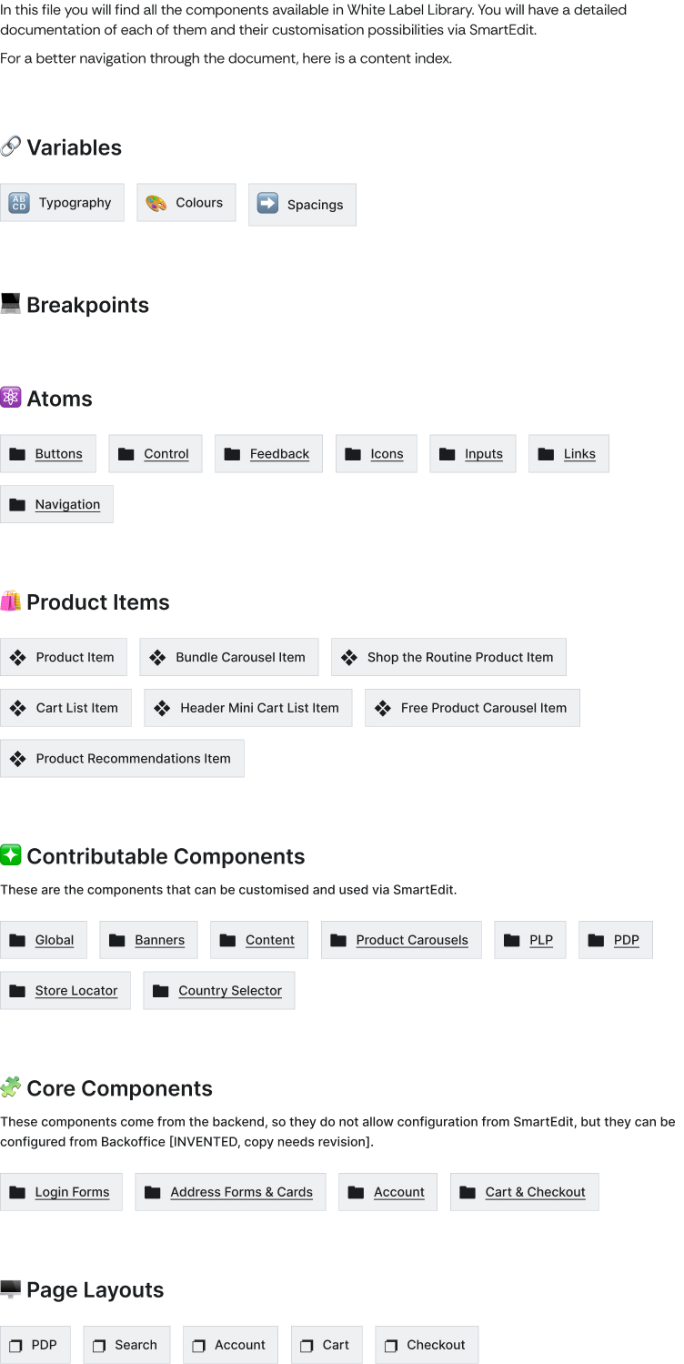
Index of White Label Library
Master Components
Core Components
Come from backend, so they do not allow configuration from SmartEdit.
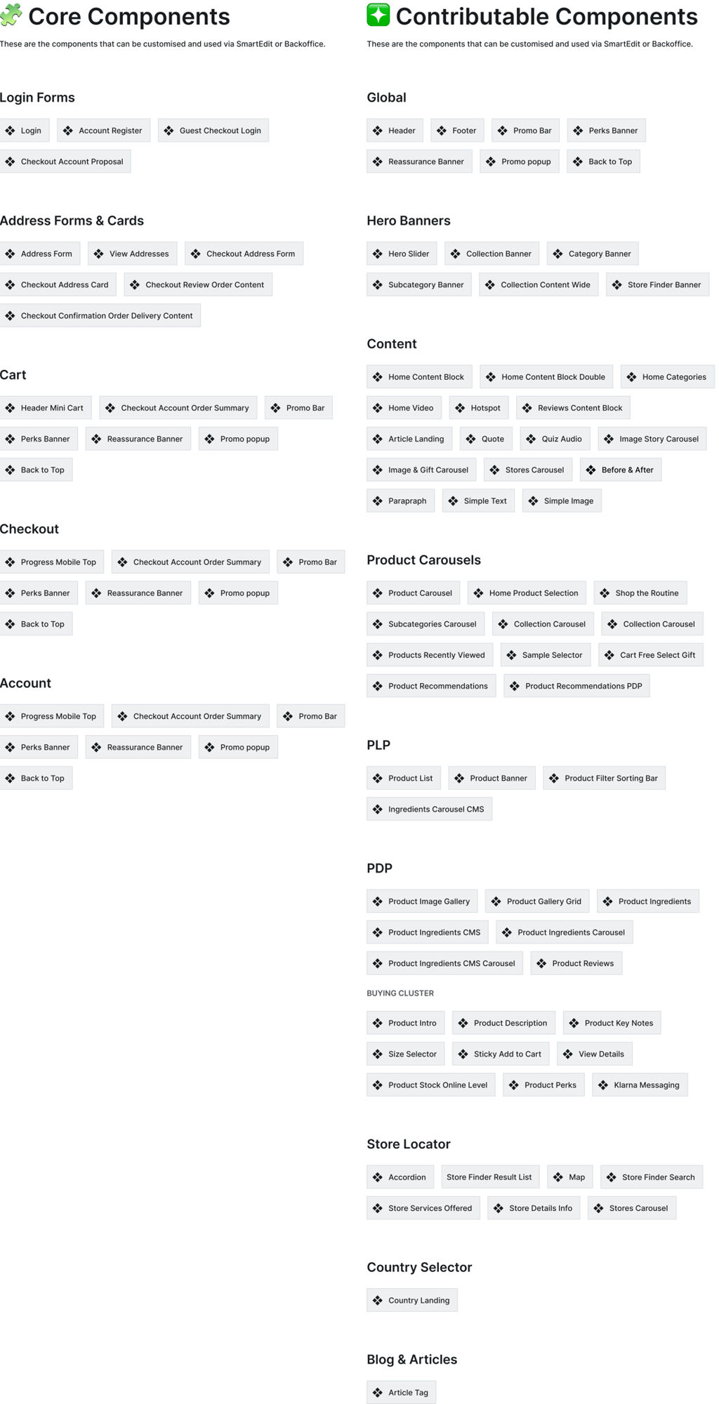
Contributable Components
Components that can be customised and used via SmartEdit or Backoffice.
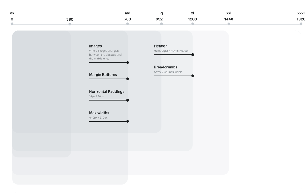
Break Points
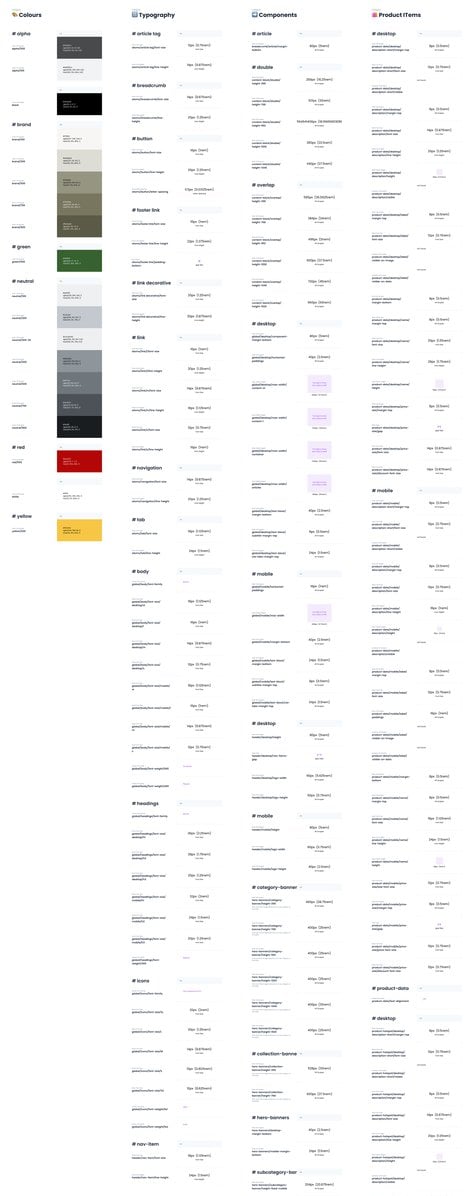
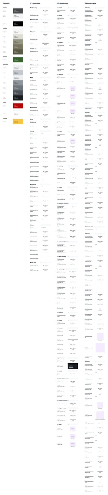
Tokens
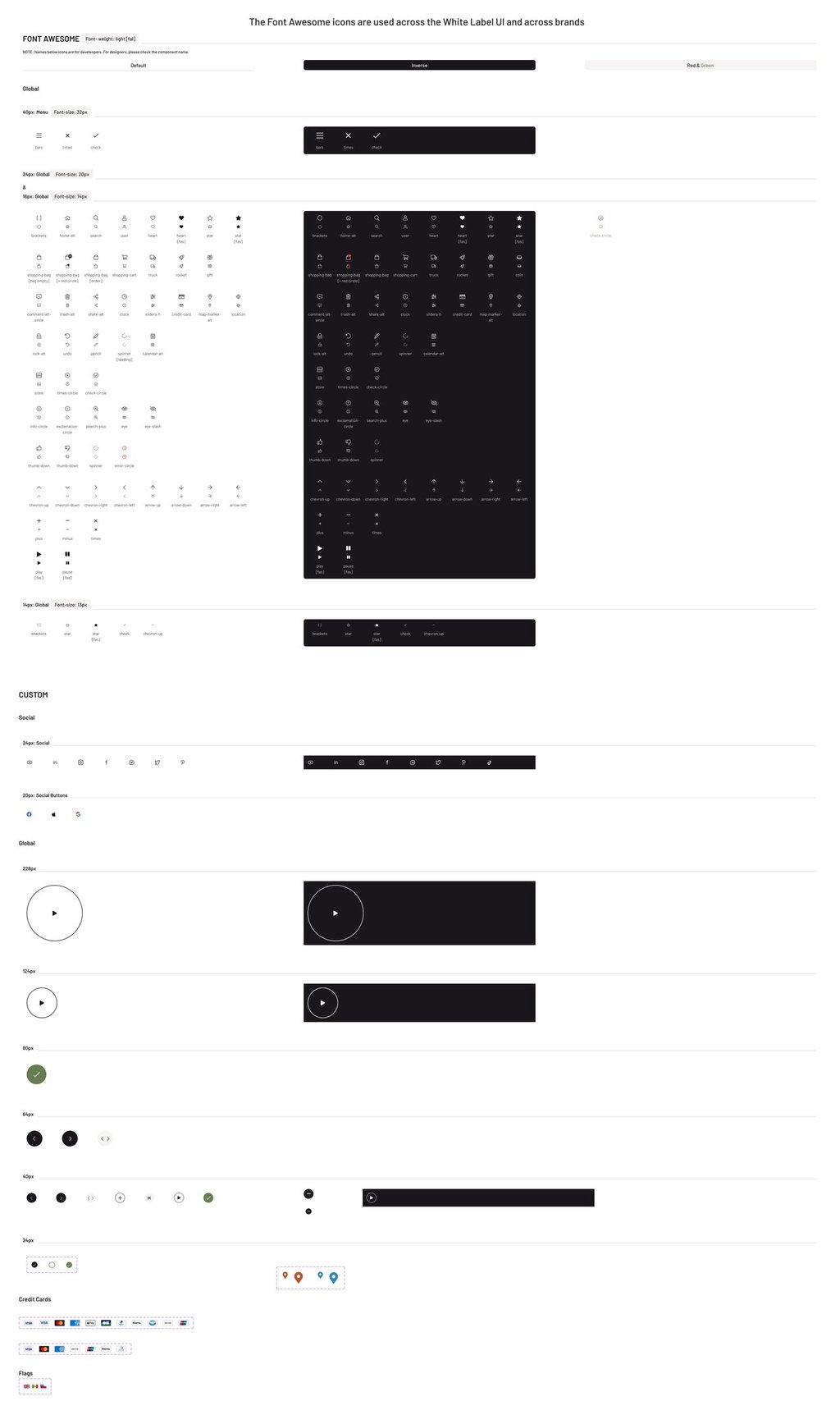
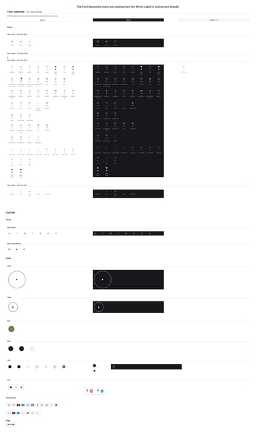
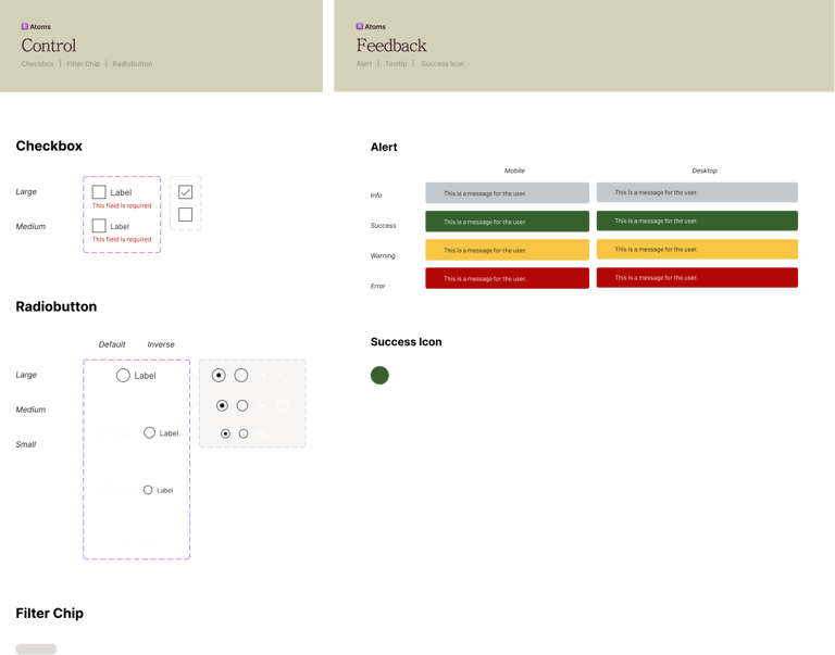
For the icon library, we used Font Awesome across all in-house brands to ensure consistency and scalability throughout the design system.
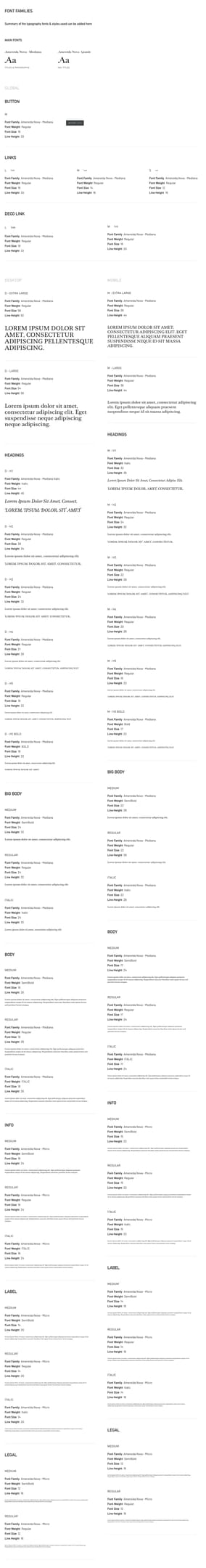
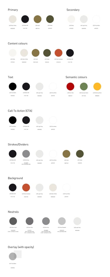
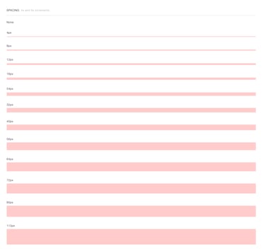
We established a comprehensive system of design tokens—covering colors, typography, spacing, and components—to ensure consistency across all in-house brands. Combined with the icon library using Font Awesome, this approach streamlined collaboration and made the design system scalable and easy to maintain.
Foundations


Typography
Colour
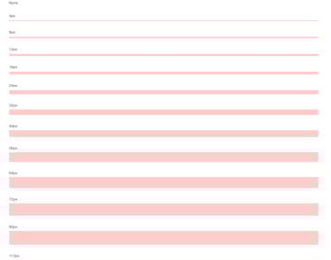
Spacing
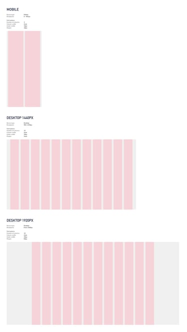
Grids
Icons
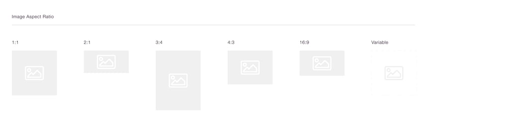

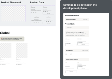
Image Aspect Ratio

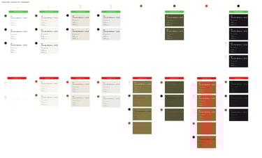
Accessibility + COLOUR PALETTE
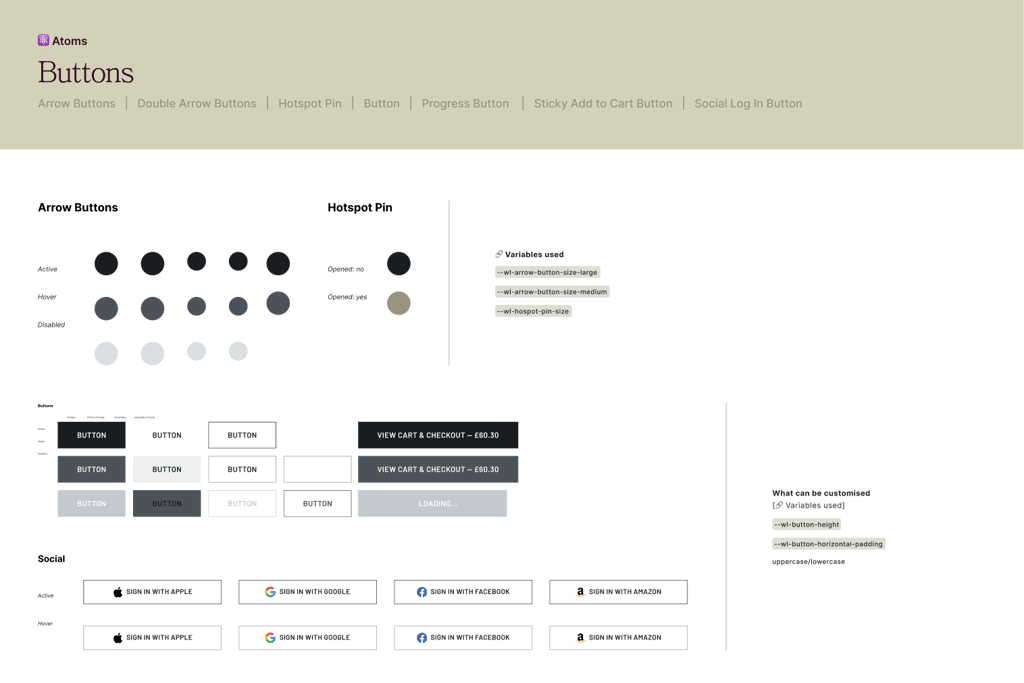
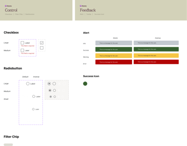
Atoms
Product thumbnail

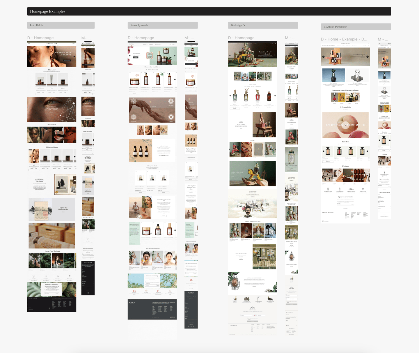
Homepage(WL)
Through different platform
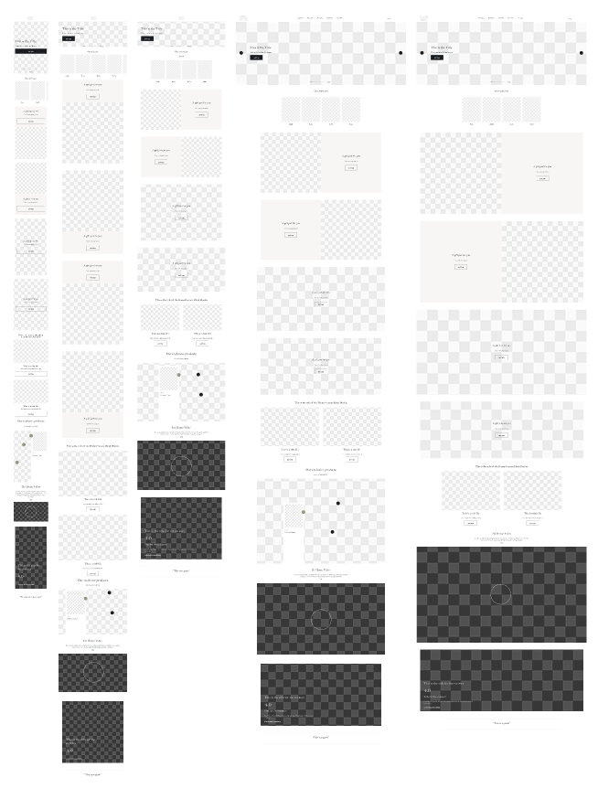

Homepage
(In-house brands)